Observational vs Constructed Photography
Observational
Observational photography is a way of shooting without being invasive, its about capturing a subject in the moment, without any adaptions or influences, just as it happens. A photographer should have no involvement creatively, and should observe in order to get the best shot. This was more of a skill before digital photography, as using film, photographers wouldn't have many chances to get the right shot. Observational photography involves the photographer being a bystander and just watching the event as it happens, the photograph is not at any moment set up in any shape or form, including lighting. All creative additions should be made after the shot is captured. The photograph is a mere depiction of reality. 'Photographing is essentially an act of non-intervention' stated Susan Sontang in 1979. This is a well observed photograph taken of the recent European storms:

http://www.bbc.co.uk/news/world-europe-24725176
Constructed
Photography that is constructed is generally the most common type of photography. It is used widely in the fashion industry. It involves the photograph being constructed by the photographer, inevitably the opposite of observational photography. The shot will be set up, styled, and created by the photographer. It is not a natural shot, as it is not taking place within the real world. In some cases a photographer can take a real world situation and manipulate it to get a better photograph. Such as in a crime scene, they could place a gun next to a body to emphasise the scene, this would be a constructive photograph. It allows the photographer to add creativity, and show off their skills within photography such as lighting, positioning and subject. 'The photograph instead of being presented as a depiction of reality, was now something created to show us things that were felt rather than seen' said Corinne Robins on 1984. These images are well constructed photograph of the recent European storms:


http://www.dailymail.co.uk/news/article-2478056/First-picture-Bethany-Freeman-fatally-crushed-tree-St-Jude-storm-death-toll-rises.html
Art Direction Research & Ideas
Lighting Assignment - Fashion vs Portrait
For our lighting assignment, we had to use one model wearing the same clothes and produce a portrait and a fashion photograph. These pictures had to look different down to the lighting and the pose.
This is my portrait image. I had a bright light placed behind me to the side, and one less bright light in front of me to my left, I felt this gave pleasant shadowing on the face. I also thought that a pose head on smiling at the camera would be most suitable for a portrait photograph.

This is my fashion photograph. The lighting here isn't ideally what I would like. Its generally brighter that the portrait photograph. The light behind me I brought more round to my right hand side. And I made the light in front of me brighter. If I was to shoot this photograph again, I would have made the light behind me a bit dimmer, and maybe moved the light in front of me round to my left a little.

Both images show elements of portrait and fashion…...
Nick Knight
I decided to research into the ideas behind a famous photographers work. The British Fashion photographer Nick Knight is most well known for launching SHOWstudio.com which is an online fashion broadcasting company which focuses on live fashion media, such as catwalks. The following images were photographed by Nick Knight for 'Garage' magazine. I believe they were inspired by Roy Lichenstein's pop art paintings from the sixties.
.jpg)

http://mode.newslicious.net/2012/09/text-talk-lindsey-wixson-by-nick-knight.html
Nick Knight is famous for his collaborations with different artists, whether it be designers, singers, or painters. Here he has brought Roy Lichenstein's artwork up-to-date, particularly focusing on the romance paintings, which were one of Lichenstein's most popular body of work. Instead of using the old fashioned speech bubbles, he has used the modern bubbles used by apple in the instant messaging world in our current day.


http://www.planetnews.info/roy-lichtenstein-artist-who-made-comic-strip-cartoons-into-art/
These photographs provoke the following ideas in my mind:
- Communication
- Femininity
- Innovation
Femininity - Nick Knight always considers women's rights in his photography, he didn't want to portray just one type of woman, whether it be by age, ethnicity, or size. He expresses how he wants to use a variety of models, including curvaceous women, as he fell in love with one. He believes the unconventional models are more interesting, as you don't want to see the same image every time. In these images femininity is shown as the women are independent, dominating, and powerful.
Innovation - In these images Nick Knight has taken Roy Lichenstein's work, and put a twist on it, made it his own. Using digital manipulation he has brought a contemporary light to his photographs using Lichenstein as inspiration. Using the model Lindsey Wixson all the latest fashions are included in Knight's homage to Lichenstein. In these images he has used his innovation to modernise the theme, and reintroduce it in an up-to-date fashion.


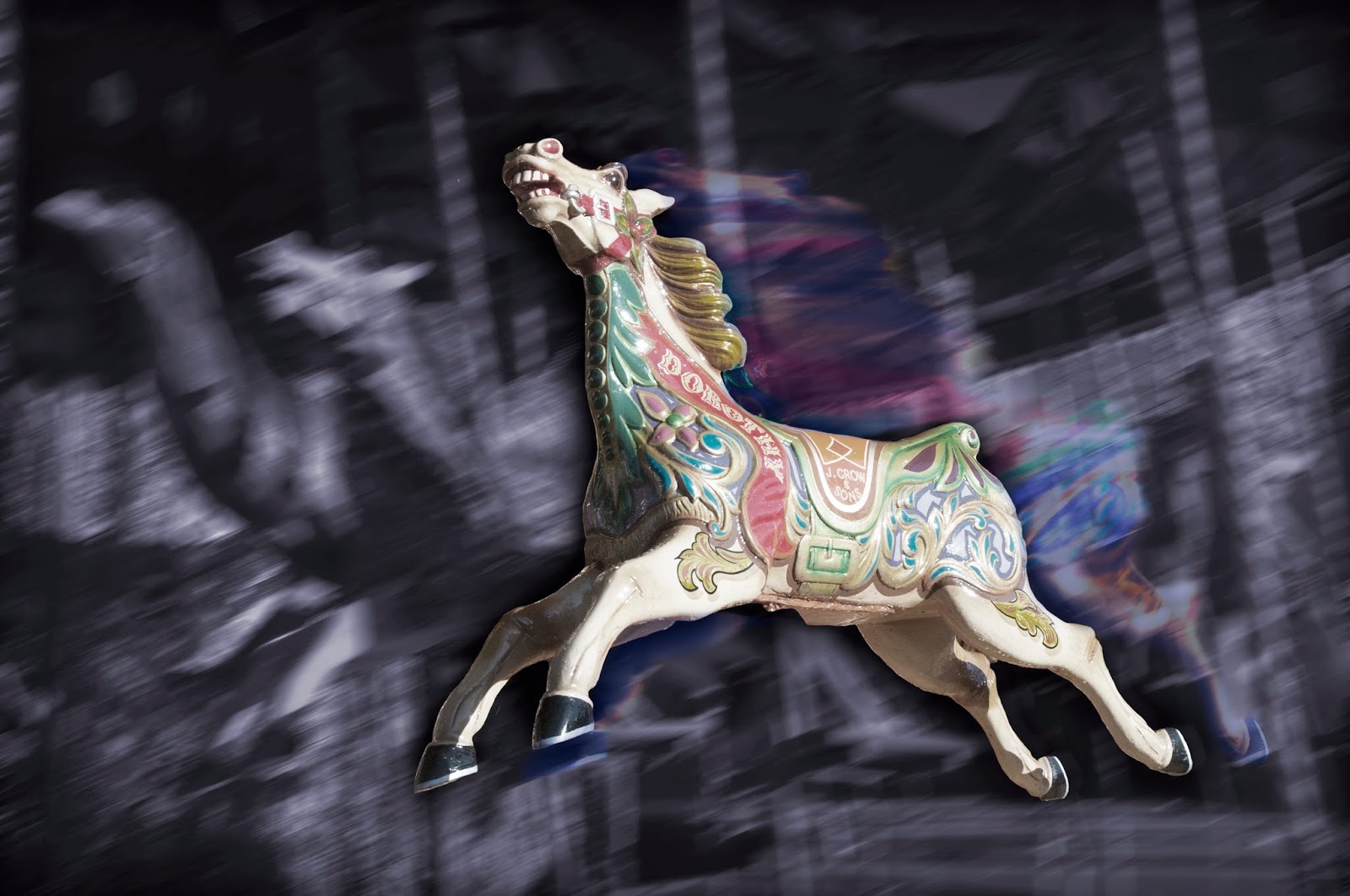
The Dark Issue
Once receiving the assignment brief and the three different topics to base our projects on, I was instantly attracted to 'The Dark Issue', I think the dark issue in photography can cover many different sub-topics and it has a wide angle from which you can approach the issue. I decided to look into dark, and mysterious photography. I brainstormed ideas behind The Dark Issue, and researched into photographers that have been noticed for their dark photography. I looked into Greg Passmore’s Krystal Beach extreme horror photography; he approaches the ‘dark’ subject through graphic gory content, facing the direct subject of death and murder. I wanted to approach ‘dark’ in a more subtle way. I then discovered Ricardo Salamanca; the Chilean photographer and photo editor is well established for his dark editing works. He will take an interesting photograph, and change it into something completely different during the editing process. This closely examined the way I wanted to approach the subject.
Ricardo Salamanca photography:


Styling
A stylist within photography aims to create an aspirational image for publication. For example, for a fashion magazine an editorial stylist would feature a model that readers can relate to, clothes that readers could buy from the way they have been styled in the shoot. In advertisements within magazines, the image would have been styled by a commercial stylist. Almost everything you see within the media would have been styled by somebody along the line. In music videos there is always a wardrobe or costume designer who has styled the artist in a way they see suitable. Catwalk shows are designed and styled by the show styling team, who would aim to portray an image that the audience can relate and aspire to. A photoshoot can be deconstructed by a stylist by many different elements, including:
- Product
- Theme
- Location
- Model
- Page Layout
- Props

Post Production
Post production and short films. Ideas for main assignment.
Art Direction Assignment
I have chosen the theme communication from my art direction task to continue with for this assignment. I believe this is the most intriguing topic. Communication can be portrayed in a number of appealing ways. Artists portray their communication through their productions, they are always trying to make the viewer understand or question a story they have represented. Below is a quick verbal brainstorma and a visual mood board of communication.


'The single biggest problem in communication is the illusion that it has taken place' said George Bernard Shaw. From brainstorming the different ideas behind communication, I found that the most sufficient way to portray it was to directly represent it. I thought up many different ideas based upon my brainstorming. I considered that the style 'retro' is very in fashion in 2013. From this, I thought that the cup and string telephone would be an alluring thing to photograph. I would have to make the cup and string telephone myself, and then experiment with photography. Below is a brief and simple storyboard of the process of my project.

I considered using a model in my photographs, but as I couldn't find a location suitable enough I thought it might slope my standard of photography. Once I had made the cup and string telephone, there wasn't much to it, I could only experiment with different lighting, and camera angles. There was no straightforward plan, I improvised as I went along. Below are the two images I originally captured based on the ideas I researched.


Below is a quick edit, done to enhance the retro style. Like Nick Knight, I have taken inspiration from Roy Lichenstein's pop art.

Digital Presentations
Animated GIF's are commonly used within features online. They are a beneficial way of interacting with the reader. Here is one I made using Nick Knights photographs of Lady Gaga for Vanity Fair.

Semiotics & Theory
Christina De Middel – The Afronauts
Christina De Middel was the creator of the photo book The Afronauts inspired from a remote
episode of Zambian history. In 1964 a Zambian high school teacher in the
space-race with USA and Russia introduced a space programme aiming to put the
first African on the moon. A training programme followed in order to prepare African
men and women to land on the moon, this plan was condemned to failure, as
rockets weren’t a physical possibility in Africa, it seemed as though
catapulting was the most pragmatic concept.
Christina De Middel decided to reestablish this event in 2012, taking
her own interpretation at the peculiar idea that Africans could build rockets
and travel to space. She lures her readers into wondering why the idea seems so
absurd. De Middel approaches the project with concern and manages to capture
surreal touching results, and accurately apprehending the absurdity and the
unconventional nature of the initial space project.
The reasoning in which the idea seems unorthodox can
be deconstructed through Saussure and Peirce’s theory of semiotics. Our
automatic thoughts and actions are often administered by an intricate set of
cultural messages and conventions and depend on our personal ability to
interpret them instinctively and immediately. We read the signs Christina De
Middel has portrayed which are Africans in homemade space suits. But how we
view these signs depend on how we interpret the signifier and the signified.
The signifiers would be African people, and the astronauts.
These two subjects separately make sense, but instantly and instinctively, when
we anticipate them together, it almost seems amiss and unnatural. This is due
to the signified, and the meanings behind the signifiers. We automatically
presume, whether it be correct or not, that native African’s are impoverished
and uneducated due to their background and environment. Whereas, astronauts
signify wealth, scientific education, and contemporary technology.
Christina De Middel has developed a myth in our minds
based on the codes she conveys in The
Afronauts photographs. ‘Myth is neither a lie nor a confession: it is an
inflexion’ states Roland Barthes. She uses African clothing on her models
instead of a full spacesuit that gives us a code of tradition. This develops
the myth that native
Africans cannot be astronauts, when indeed they can in the present day. Therefore,
the story is based on a myth, but it is not fictional. It is an improbable project that combines myth and reality. De Middel
reconstructs the idea and the cliché to ‘raise
awareness of how we consume the image of Africa that is given in the media, and
how a whole continent has been stigmatised.’ Her photographs force the viewer to spend more time on the image to
understand the meanings of the story.


The Dark Issue
Once receiving the assignment brief and the three different topics to base our projects on, I was instantly attracted to 'The Dark Issue', I think the dark issue in photography can cover many different sub-topics and it has a wide angle from which you can approach the issue. I decided to look into dark, and mysterious photography. I brainstormed ideas behind The Dark Issue, and researched into photographers that have been noticed for their dark photography. I looked into Greg Passmore’s Krystal Beach extreme horror photography; he approaches the ‘dark’ subject through graphic gory content, facing the direct subject of death and murder. I wanted to approach ‘dark’ in a more subtle way. I then discovered Ricardo Salamanca; the Chilean photographer and photo editor is well established for his dark editing works. He will take an interesting photograph, and change it into something completely different during the editing process. This closely examined the way I wanted to approach the subject.
Ricardo Salamanca photography:

http://designyoutrust.com/photography/ricardo-salamanca-salamagica/

http://www.crystalxp.net/news/en495-ricardo-salamanca-salamagica-.html

http://www.crystalxp.net/news/en495-ricardo-salamanca-salamagica-.html

http://www.pondly.com/2011/06/photo-editing-genius-ricardo-salamanca/
Inspirational Photography and moving image:

http://panoramas.annesaintpeter.com/work/panoramas/02


http://thisislavie.com/womens/asia-bugajska-in-black-magic-for-zink-magazine

http://laracrudgington.blogspot.co.uk/2011/08/gypsy-shoot-on-love-lane.html
http://www.youtube.com/watch?v=FNZq0uMvNXo


http://www.deviantart.com/?view_mode=2&order=24&q=by%3ATheVenomousSwan
Firstly,
I chose where and what I wanted to photograph, I decided on the German Market
in Leeds Millennium Square. But obviously, the German Market doesn’t instantly
provoke the ‘dark’ thought in your mind. So I decided that I would work in similar
ways to Ricardo Salamanca, I would take photographs of things that would
usually be seen as jubilant and innocent, and put my own twist on them to make
them appear ‘dark’. I thought this process itself would add to the ‘dark’
subject because the viewer will be disturbed that they are looking at something
usually viewed as happy, but it has been made to look mysterious and eerie. When
photographing I kept repeating the words ‘gypsies’, ‘bewitching’, and
‘black-magic’, as this was the overall look I was aiming for in my photographs.
My 10 Images:


Contact Sheets of everything shot prior to editing:


This comment has been removed by the author.
ReplyDelete